Donation Buttons Explained: How Nonprofits Customize Donation Buttons for Online Giving

.png)
In the digital landscape of nonprofit fundraising, every element of your website plays a crucial role in engaging potential donors and converting interest into vital support. Among these elements, the humble donation button stands as a powerful, yet often overlooked, gateway to financial contributions. It’s not merely a graphical element; it’s a strategic communication tool, a reflection of your organization's professionalism, and a key driver of online giving. As online giving continues to grow, accounting for 12% of total giving in 2023, optimizing this critical touchpoint is paramount. This article will guide you through online fundraising best practices and the art and science of creating and customizing nonprofit donation buttons to maximize their effectiveness and significantly boost your online fundraising efforts.
The Power of a Purposeful Donation Button: Why it's Critical for Nonprofits
A well-designed donation button is more than just an aesthetic choice; it's a fundamental component of a successful online fundraising strategy. Its impact reverberates through donor engagement, trust-building, and ultimately, the financial health of your organization.
More Than Just a Click: The Gateway to Online Giving
At its core, a donation button serves as the primary call to action (CTA) for online giving. It’s the digital equivalent of an open door, inviting supporters to contribute to your cause. For many prospective donors, this button is the first and most direct path to making a financial contribution. Its prominence and clarity are paramount, as 54% of donors prefer giving directly through a charity's website, a preference that significantly outweighs other giving platforms. This direct channel allows nonprofits to control the donor experience and reinforce their brand message at the point of commitment.
Building Trust and Credibility Through Professional Design
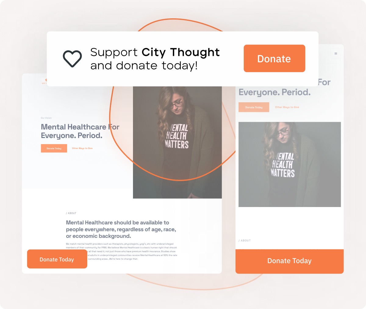
The visual presentation of your donation button and the surrounding donation page significantly influences a customer's perception of your organization's legitimacy and professionalism. A generic, poorly designed, or hard-to-find button can inadvertently signal a lack of attention to detail or even raise suspicions. Conversely, a button that is visually appealing, clearly branded, and integrated seamlessly into a professional website design builds immediate donor trust. It communicates that your organization is well-managed and that donors' contributions will be handled with care. This professional appearance is not just about aesthetics; it's about establishing credibility and assuring potential donors that their support will be impactful. Custom-branded donation pages nested inside a nonprofit's website, for instance, raise six times more money than those that aren't, underscoring the power of a cohesive and branded user experience.
Directly Impacting Conversion Rates and Boosting Online Giving
The primary objective of any nonprofit's online presence is to facilitate engagement and generate support. Donation buttons are direct conduits for this support. Their effectiveness is directly measured by their ability to drive conversions – that is, to turn a visitor into a donor. A strategically designed and placed button, with compelling donor-centric messaging and a clear visual hierarchy, can dramatically increase the likelihood of a click. This increase in clicks, in turn, leads to more donations and a higher overall volume of online giving. It’s a direct correlation: better buttons mean more financial resources to fuel your mission.
The User Experience: Making Giving Seamless and Enjoyable
Beyond the initial click, the entire donation process must be smooth and intuitive to ensure a positive user experience. A complicated or frustrating experience can lead to abandoned carts and lost donations. Customized donation buttons are the first step in creating this seamless journey. They signal to the donor that their needs and convenience have been considered. When a button’s text aligns perfectly with the campaign’s message, and its design leads them directly to a relevant, easy-to-navigate donation form, the user experience is enhanced. This positive interaction not only increases the likelihood of completing the donation but also fosters goodwill, encouraging repeat engagement and potentially transforming a first-time donor into a loyal supporter.
Understanding Customization: Beyond the Generic "Donate Now"
To truly leverage the power of your donation buttons, it's essential to move beyond basic, out-of-the-box solutions and embrace the concept of customization. This means tailoring every aspect of the button and its accompanying journey to resonate with your audience and achieve your fundraising objectives.
Defining "Customization" for Nonprofit Donation Buttons
At its heart, customization is the act of adapting or modifying something to meet specific requirements. When applied to nonprofit donation buttons, it means going beyond the default "Donate Now" text and standard button shape. It involves strategically adjusting elements like the wording, color, size, shape, and placement to align with your organization's brand, the specific campaign being promoted, and the preferences of your target donor segments. Think of it as tailoring the customer interaction to feel personal and relevant, ensuring the button effectively communicates your needs and inspires action. Merriam-Webster, for instance, defines "customize" as "to modify or build according to particular specifications or for a particular customer." This definition perfectly encapsulates the approach needed for effective donation buttons.
Why a One-Size-Fits-All Approach Fails to Engage Donors
In today's diverse digital landscape, a generic "Donate Now" button plastered on every page of your website is unlikely to be as effective as a thoughtfully customized one. Donors are not a monolithic group; they have varying motivations, levels of engagement, and preferences. A blanket approach fails to acknowledge these differences. It misses opportunities to:
- Speak directly to specific donor interests: A button tailored to a particular program can be more compelling than a general one.
- Reflect brand identity: A customized button reinforces your organization's unique voice and visual identity.
- Guide the donor journey: Different campaigns or donor segments might require different calls to action or landing pages.
A one-size-fits-all strategy often results in missed opportunities for engagement, lower conversion rates, and a less impactful user experience.
Customization vs. Personalization: Leveraging Both for Deeper Engagement
While often used interchangeably, customization and personalization are distinct yet complementary concepts that are crucial for maximizing donor engagement. Customization, as discussed, refers to tailoring a general offering (like a donation button) to meet specific requirements or target a particular group. For example, customizing a button to say "Fund a Meal" for a hunger-relief campaign is a form of customization.
Personalization, on the other hand, takes this a step further by tailoring the experience to an individual user based on their past interactions, preferences, or demographic data. An example would be a website dynamically displaying a button that says "Thank you for your previous support, [Donor Name]! Continue your impact by..." This is a highly customized and personalized approach.
For nonprofits, leveraging both is key. Customization ensures that your buttons are strategically designed for different campaigns and segments. Personalization allows you to make that customized offering even more relevant to the individual user, creating a deeply engaging and memorable giving experience. This dual approach builds stronger relationships and encourages greater generosity.
Key Elements to Customize for Maximum Donor Engagement
Effective donation buttons are not accidental; they are the result of deliberate choices about their design and functionality. By focusing on key customizable elements, nonprofits can transform these buttons from simple links into powerful fundraising tools.
Compelling Button Text (Call to Action - CTA): Your Direct Communication
The text on your donation button is your most direct form of communication with a potential donor at the moment of decision. While "Donate Now" is functional, it can be generic. Customizing this text can significantly enhance its persuasive power. Consider the impact of buttons that are more specific, benefit-oriented, or emotionally resonant:
- Benefit-Oriented: "Give Hope Today," "Sponsor a Child's Education," "Fund Clean Water."
- Action-Oriented (Campaign Specific): "Help Us Reach Our Goal," "Support Disaster Relief," "Invest in Research."
- Urgency-Driven: "Give Now Before It's Too Late," "Double Your Impact Today."
The key is to ensure the text is clear, concise, and directly relates to the donor's potential impact or the immediate need. This focused donor communication makes the act of giving feel more meaningful and less transactional.
Strategic Visual Design: Colors, Shapes, and Fonts for Impact
The visual design of your donation button is crucial for attracting attention and influencing user behavior. Customization here involves more than just picking a color; it's about leveraging design principles to guide the eye and evoke the right response.
- Color: Use colors that create contrast with your website's background, making the button stand out. Often, a bright, attention-grabbing color is recommended, but it should also align with your brand's overall color palette. Color psychology can play a role; for example, green is often associated with growth and positive action, while blue can convey trust and stability.
- Shape: Standard rectangular buttons are common, but rounded corners can sometimes appear more approachable. Experimentation is key.
- Fonts: Ensure the font used is legible and consistent with your website's typography. The size of the font within the button should be proportionate to the button’s overall size.
Professional design is paramount. A button that looks like an afterthought can diminish the donor's confidence. Customized designs that reflect your organization's branding and values enhance the overall user experience and reinforce trust.
Optimal Button Placement: Guiding Donors Naturally
Where you place your donation button is as important as how it looks. Strategic placement guides donors naturally towards making a contribution without feeling pressured. Common, effective placements include:
- Website Header: A persistent button in the top navigation bar ensures it's visible on every page.
- Above the Fold: Placing the button prominently on your homepage, where it's visible without scrolling.
- Within Relevant Content: On blog posts, program pages, or impact stories that discuss your work, embedding a donation button can capture interest at its peak.
- Footer: A less prominent but still accessible option.
The goal is to make the button discoverable without being intrusive. Considering that 54% of donors prefer giving directly through a charity's website, ensuring your button is easy to find on your site is critical.
Targeted Destination URLs: Directing Donors Efficiently
The URL your donation button links to is a critical part of the user experience. Simply linking to your homepage is often insufficient. Customization here means ensuring that when a donor clicks your button, they are directed to a specific, relevant page that facilitates their giving.
- Campaign-Specific Landing Pages: If the button text is "Fund a School Project," it should lead to a page detailing that specific project and its funding needs.
- Pre-Filled Forms: For recurring donation buttons, the destination URL could lead to a form with the recurring option already selected.
- Branded Donation Pages: Nonprofits that use custom-branded donation pages nested inside their website often see significantly higher donation amounts, underscoring the importance of a cohesive journey.
This targeted approach reduces friction, clarifies the donor's intended impact, and streamlines the path from intent to donation, enhancing the overall customer experience.
Practical How-To: Implementing Your Customized Donation Buttons
Implementing customized donation buttons involves leveraging the right tools and understanding the technical considerations that ensure they function smoothly across devices, browsers, and giving scenarios. Before diving into design or development, it’s important to start with the right foundation.
Start with a Fundraising Platform That Supports Customization
The flexibility of your donation buttons is largely determined by the fundraising platform you choose. Some platforms limit how buttons look, where they can live, or how they connect to the donation experience, which can restrict branding and reduce conversion potential.
When evaluating a platform, look for the ability to:
- Customize button text, colors, fonts, and styles to match your website
- Embed donation buttons directly on your site (not just link out)
- Connect buttons to fully customizable donation forms
- Support both one-time and recurring giving from the same experience
Platforms like Donately are designed with this flexibility in mind, allowing nonprofits to create branded donation buttons that embed seamlessly across their website and connect to customizable donation forms. This ensures donors experience a consistent, trustworthy flow from click to confirmation.
Once you’ve selected a platform that supports true customization, implementation becomes significantly easier and more effective.
Leveraging Website Builders and Content Management Systems
Most nonprofits use website builders or Content Management Systems (CMS) like WordPress, Webflow, Wix, or similar platforms. These tools offer accessible ways to create and manage donation buttons without extensive technical expertise.
- Built-in features: Many CMS platforms include drag-and-drop interfaces or pre-designed button components that allow for basic customization of text, colors, and links.
- Plugins and extensions: For more advanced needs, plugins and extensions can embed donation forms directly into your site, enabling richer customization and improved donor experiences. For example, many WordPress plugins allow nonprofits to embed donation forms with branded buttons that align with their site design.
- Third-party donation platforms: Services like Give Lively, Stripe, or PayPal offer embeddable donation buttons and forms, though customization options may vary depending on the platform.
Together, these tools make it possible for organizations of all technical skill levels to implement visually appealing and functional donation buttons.
Advanced Customization with HTML and CSS
For organizations with web development resources, donation button customization can go further using HTML and CSS, offering granular control over appearance and behavior.
- HTML defines the structure and content of the button (for example, <button>Support Our Mission</button>).
- CSS (Cascading Style Sheets) controls styling elements such as colors, fonts, sizing, borders, spacing, hover effects, and responsiveness.
While this approach requires technical expertise, it allows nonprofits to create highly distinctive donation buttons that align precisely with brand guidelines and user experience goals.
Ensuring Cross-Browser and Device Compatibility
A customized donation button must perform reliably across all major browsers (Chrome, Firefox, Safari, Edge) and devices (desktops, tablets, smartphones). This consistency is critical to maintaining donor trust and minimizing friction.
- Responsive design: Buttons and donation pages should adapt seamlessly to different screen sizes. While 57% of nonprofit website traffic comes from mobile devices, 75% of online giving revenue still comes from desktops (Double the Donation), underscoring the importance of optimizing for both.
- Testing: Test donation buttons across multiple browsers and devices before launch. Browser developer tools and online testing platforms can help identify issues early.
- Accessibility: Ensure buttons meet WCAG accessibility standards, including sufficient color contrast, readable text, and keyboard navigation support.
Neglecting compatibility and accessibility can create barriers for donors and result in lost contributions, even when intent to give is high.
Strategic Customization for Diverse Fundraising Campaigns and Donor Segments
The most effective donation buttons are not static; they evolve to meet the specific needs of your fundraising efforts and resonate with different groups of supporters. Strategic customization allows you to tailor these critical touchpoints for maximum impact.
Tailoring Buttons for Specific Fundraising Campaigns
Each fundraising campaign has a unique goal, message, and urgency. Your donation buttons should reflect this.
- Campaign-Specific Text: Instead of a generic "Donate," use text that directly relates to the campaign, such as "Fund a School Backpack," "Help Shelter Animals," or "Support Our Annual Gala." This creates immediate context and emotional connection.
- Visual Theme Alignment: Adjust button colors or imagery to align with the campaign's visual theme, reinforcing its identity.
- Targeted Landing Pages: As mentioned, ensure the button links to a page that provides details about the specific campaign, its impact, and how the donation will be used.
This level of donation form button customization ensures that donors understand exactly where their money is going and the specific impact they are making, enhancing engagement and encouraging contributions.
Customizing for Recurring Donors: Cultivating Long-Term Support
Recurring donations are the lifeblood of many nonprofits, providing predictable revenue. Customizing buttons to specifically encourage monthly or recurring gifts is highly effective.
- Clear Call to Action: Use phrases like "Become a Monthly Supporter," "Join Our Sustainer Program," or "Give Monthly to Make a Lasting Impact."
- Highlighting Benefits: If applicable, subtly hint at the benefits of recurring giving, such as impact over time or exclusive updates.
- Dedicated Landing Pages: Link these buttons to a donation page specifically designed to highlight the advantages of recurring giving and streamline the sign-up process for monthly donations.
The growth in recurring donors is significant, with the average nonprofit seeing their number of recurring donors grow 127% from 2018 to 2022. Furthermore, monthly giving accounted for 31% of all online revenue for nonprofits, demonstrating the substantial impact of prioritizing these calls to action.
Integrating with Donor Segmentation for Hyper-Personalization
The ultimate form of customization is personalization, achieved by segmenting your donor base and tailoring the donation button experience to individual donors.
- Segmented Messaging: Based on donor history or interests, you can display different buttons. For instance, a donor who has previously supported a specific program might see a button like "Continue Supporting [Program Name]."
- Personalized Greetings: While not directly on the button, the landing page can use personalized greetings like, "Thank you for your continued commitment, [Donor Name]."
- Dynamic Content: With advanced technology and software, you can even dynamically change button text or offers based on user data captured during their browsing session.
This hyper-personalized approach makes donors feel valued and understood, significantly increasing their likelihood of giving and fostering deeper loyalty. It elevates the customer experience by demonstrating that you recognize and appreciate their individual contribution to your mission.
Measuring Success and Optimizing Your Customized Buttons
The journey of customization doesn't end once the buttons are live. Continuous measurement and optimization are crucial for maximizing their impact and ensuring they remain effective fundraising tools.
Key Metrics to Track for Performance Evaluation (data)
To understand how well your customized buttons are performing, you need to track specific metrics. Relying solely on click-through rates is insufficient.
- Conversion Rate: The percentage of users who click the button and complete a donation. This is the most critical metric for success.
- Average Donation Amount: Track the average donation value originating from your customized buttons.
- Bounce Rate on Landing Pages: A high bounce rate indicates that the page linked from the button isn't meeting donor expectations or is difficult to navigate.
- Donor Retention: For recurring donation buttons, track the rate at which new recurring donors continue their support over time.
- Revenue Generated: The total amount of money raised directly through the buttons you've customized.
Analyzing this data provides actionable insights into what's working and where improvements are needed.
Tools for Analytics and A/B Testing (software, recommendations)
Several software tools can assist in tracking performance and implementing optimization strategies.
- Website Analytics: Platforms like Google Analytics are essential for tracking user behavior, button clicks, and conversion rates across your website.
- A/B Testing Tools: Tools such as Google Optimize, Optimizely, or built-in features within some CMS and donation platforms allow you to test variations of your buttons (e.g., different text, colors, or placements) against each other. This data-driven approach provides concrete recommendations for improvement.
- Heatmaps and Session Recordings: Applications like Hotjar offer visual insights into how users interact with your pages, showing where they click, scroll, and get stuck.
These tools empower you to make informed decisions based on actual user behavior, not just assumptions.
The Iterative Process: Continuous Optimization Based on Data (user experience)
Customization is not a one-time task but an ongoing process. The digital landscape evolves, and so do donor expectations. Regularly reviewing your metrics and using A/B testing to refine your buttons is key to continuous improvement.
- Iterate on CTA Text: Test different wording to see which phrases drive the most engagement.
- Experiment with Visuals: Try different color schemes, button sizes, and shapes to see what converts best.
- Optimize Landing Pages: Ensure the journey after the click is as smooth as the button itself. Poor landing page experience can negate the effectiveness of even the best button.
- Segment and Personalize Further: As you gather more data, refine your segmentation strategies for even more targeted and personalized appeals.
By embracing this iterative process, driven by data and focused on improving the user experience, you can ensure your donation buttons remain highly effective fundraising assets.
Common Pitfalls to Avoid When Customizing Donation Buttons
While the benefits of customization are significant, several common pitfalls can undermine your efforts. Being aware of these traps can help you navigate the process more effectively.
Over-Customization Leading to Visual Clutter and Confusion
While customization is beneficial, excessive or poorly executed design choices can lead to a button that is visually jarring, hard to understand, or difficult to click. This can happen when:
- Too many colors or fonts are used, making the button clash with the overall site design.
- The text is too long or uses jargon that the donor doesn't understand.
- The button's purpose is unclear, leading to donor confusion and abandonment.
The goal is to enhance clarity and impact, not to create a visual distraction.
Neglecting Mobile Optimization and Responsive Design (user experience)
As highlighted earlier, a significant portion of website traffic comes from mobile devices. Failing to ensure your customized donation buttons are fully responsive and render correctly on smartphones and tablets is a critical oversight. A button that looks great on a desktop but is tiny, unclickable, or misaligned on a mobile device creates a terrible user experience. This can lead to substantial lost revenue, as users will likely abandon the process rather than struggle with a poorly optimized interface.
Lack of Clear Communication Regarding the Donation's Purpose
A customized button's text is vital for setting expectations. If the text is vague or misleading about what the donation will achieve, it can lead to disappointment. For example, a button saying "Support Our Work" is less effective than one specifying "Fund a Child's Education" if that's the campaign's focus. Clear communication from the button's text all the way to the donation landing page is essential for building trust and ensuring donor satisfaction.
Failing to Test Buttons Across Different Browsers and Devices
Customization without testing is a gamble. A button that looks perfect in one browser or on one device might render incorrectly or be non-functional in another. This inconsistency creates a fragmented user experience and can deter donors. Rigorous testing across all major browsers and devices is non-negotiable.
Not Tracking Performance or Using Data for Improvement
The most common pitfall is treating button customization as a static implementation. Without tracking key metrics and using that data to inform ongoing optimization, you miss opportunities to significantly increase your fundraising ROI. Regular analysis and A/B testing are essential for adapting your buttons to changing donor behaviors and maximizing their effectiveness.
Conclusion
The donation button, often a small element on your website, holds immense power in driving online giving for your nonprofit. By moving beyond generic templates and embracing thoughtful customization, you can transform these buttons into compelling gateways for support. From refining the communication through strategic text and design, to ensuring a seamless user experience with optimal placement and targeted landing pages, every decision matters.
Understanding the nuanced interplay between customization and personalization allows you to create tailored giving journeys that resonate deeply with your supporters. Leveraging the right technology and software makes implementing these sophisticated strategies achievable, while rigorous testing and continuous optimization based on data ensure your efforts yield maximum results. Remember, a well-crafted donation button isn't just about asking for money; it's about inviting individuals to become active participants in your mission, fostering trust, and building lasting relationships. By investing in the strategic customization of your donation buttons, you are investing in the future of your nonprofit and its ability to create meaningful impact. Implement these insights, experiment, measure, and watch your online giving flourish.
Let's Fundraise Together!
Sign up today and see why thousands of organizations trust Donately to manage their online fundraising.
.webp)